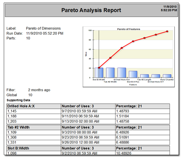
Pareto Chart
There are actually two different versions of the Pareto chart; by defect rate and by assignable cause. Per usual, the Pareto chart shows your worst offenders. Using the 80%-20% rule, you can determine which issues you want to address first by simply looking at what is causing most of your problems. Per usual, clicking on the bars will drill into the individual data points. In addition the chart includes a cross hair so you can use your mouse for targeting.
Pareto Chart (By Defect Rate)
This Pareto chart sorts the list of characteristics by the ones that fail (out of spec) the most to the ones that fail the least allowing users to quickly find the worst performing.
Pareto Chart (By Assignable Cause)
This version of the chart sorts the list of assignable causes (rather than characteristics) by the ones used most often. Therefore, instead of looking at out of spec conditions, it is reporting which causes are being assigned most often and therefore identifying the most common reasons control limits are broken. This can provide valuable insight into what is causing process instability.